
Container Style Queries and :open: CSS That Understands Size and State
Since May 2026, CSS components can adapt to their container's size AND visual state without JavaScript. Container style queries and the :open pseudo-class are both Baseline. Real-world analysis with production code, migration patterns, and the decision framework we use at Mintec.
Container Style Queries and :open: CSS That Understands Size and State
In May 2026, two CSS features hit Baseline simultaneously: container style queries and the :open pseudo-class. Together, they change how we build components — for the first time, a CSS component can react to size, theme, and state from its environment with zero JavaScript.
This isn't theoretical. Across Mintec's projects — design systems, forms, dashboards — the recurring pattern was: components need to adapt to their container (already solved with size-based container queries), but they also need to respond to the parent's active theme, or to whether a child is open or closed. The solution was always JavaScript: ResizeObserver for size, MutationObserver for state, and a pile of toggle classes that accumulated in every build.
Now CSS resolves both natively. Let's see exactly how.
The Two Most Common Hacks This Eliminates
Hack 1: The Custom Property Toggle Trick
Before style queries, the most common pattern for context-aware components was the "custom property toggle hack":
/* The parent sets a custom property */
.card {
  --theme: light;
}
.card[data-theme="dark"] {
  --theme: dark;
}

/* The child inherits it, but CANNOT conditionally style based on its value */
.card-header {
  background: var(--theme); /* works, but passive */
}
The problem: the component inherits the value but can't react to it conditionally. If --theme is "dark," the component has no way to say "if the theme is dark, adjust this." The only way out was JavaScript that read the custom property and applied classes.
Hack 2: State Tracking with JavaScript
For open/closed state, the pattern was:
// Every control needed its own observer
const details = document.querySelector('details');
details.addEventListener('toggle', () => {
  details.classList.toggle('is-open', details.open);
  details.closest('.accordion')
    ?.classList.toggle('has-open-child', details.open);
});
Every <details>, every <dialog>, every <select> needed its own listener. And if you needed to style an ancestor based on a child's state — the most common accordion pattern in the world — you had to bubble the event upward.
Both native solutions eliminate both hacks.
Container Style Queries: Components That Read the Context
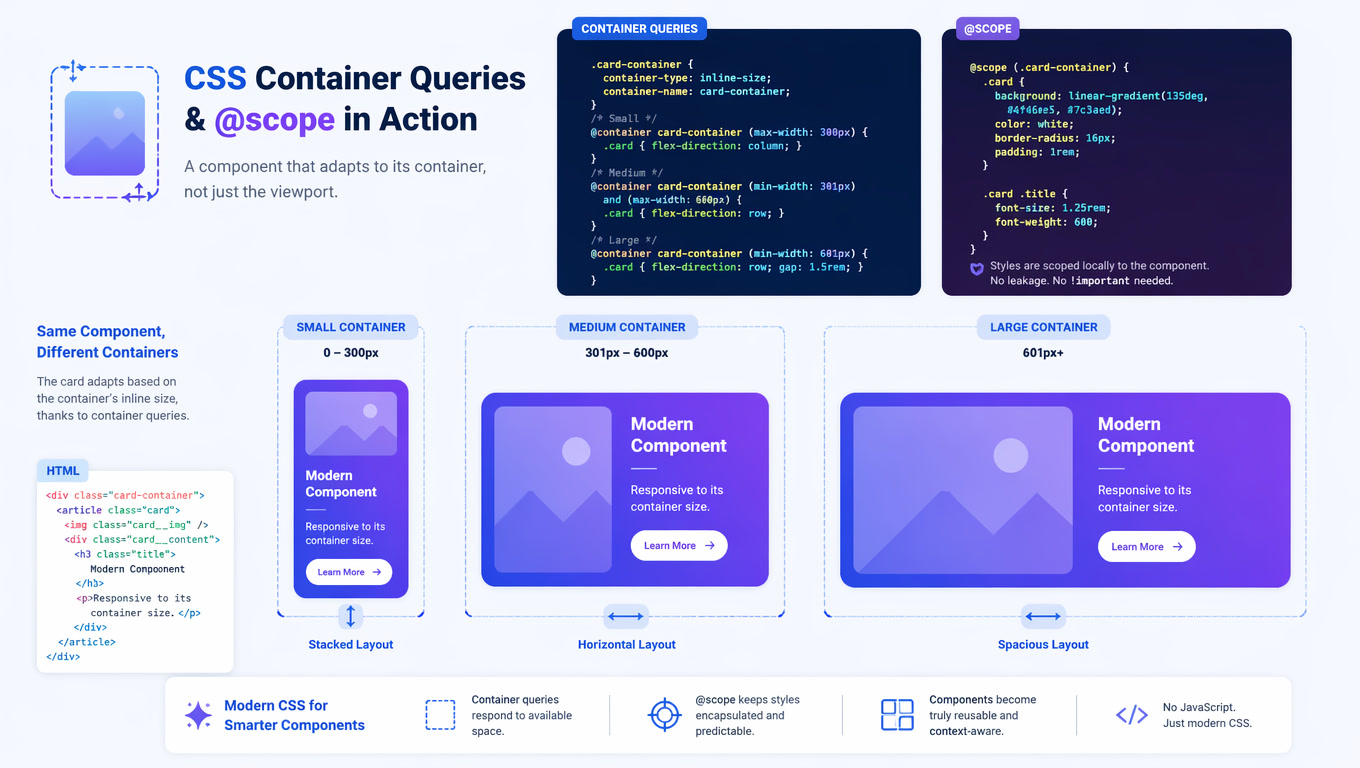
Container style queries extend @container so you can query not just size but custom properties of a container:
/* The container declares containment support */
.card-container {
  container-type: inline-size;
  container-name: card;
}

/* Size query (already existed) */
@container card (min-width: 400px) {
  .card { display: grid; grid-template-columns: 200px 1fr; }
}

/* Style query — THIS IS NEW! */
@container card style(--theme: dark) {
  .card-title { color: #f0f0f0; }
  .card-body { background: #1a1a2e; }
}
The critical difference: the style query doesn't ask "how big is the container?" but "what value does this custom property have in the container?" The component adapts to its visual context, not just available space.
Property Registration for Precise Comparisons
For exact value comparisons, register properties with @property:
@property --theme {
  syntax: "<color>";
  initial-value: #ffffff;
  inherits: true;
}

@container style(--theme: #1a1a2e) {
  .card-body { background: #0d0d1a; }
}
@property gives the browser the property type, so style(--theme: #1a1a2e) compares colors, not strings.
The Design System Pattern with Style Queries
In a real design system, style queries eliminate the need to pass props for variants:
/* One component, multiple contexts */
.button {
  padding: 0.75rem 1.5rem;
  border-radius: 0.5rem;
  font-weight: 600;
}

@container style(--variant: primary) {
  .button {
    background: #2563eb;
    color: white;
  }
}

@container style(--variant: danger) {
  .button {
    background: #dc2626;
    color: white;
  }
}

@container style(--size: compact) {
  .button {
    padding: 0.375rem 0.75rem;
    font-size: 0.875rem;
  }
}
The parent sets --variant and --size as custom properties, and the component adapts without receiving a single additional prop. This is particularly valuable in systems where content is dynamic — a CMS rendering components in different contexts without controlling the classes they receive.
:open: One Selector for All Open Controls
:open is a pseudo-class that selects any element with an open/closed state while it is in the open state. It covers more elements than you expect:
/* Expanded details */
details:open > summary {
  background: #eef2ff;
  border-bottom: 1px solid #c7d2fe;
}

/* Shown dialog */
dialog:open {
  opacity: 1;
  transform: scale(1);
}

/* Select with visible dropdown — this was impossible before! */
select:open {
  border-color: #4f46e5;
  box-shadow: 0 0 0 3px rgb(79 70 229 / 0.2);
}

/* Input picker (color, date, etc.) open */
input[type="color"]:open {
  outline: 2px solid #4f46e5;
}
What makes :open special: before May 2026, a <select> dropdown's state was invisible to CSS. There was no selector that said "this select has its picker open." Developers used focus-within as a proxy — which isn't the same, because a select can have focus without the picker open, and vice versa.
:open + :has(): The Definitive Accordion Pattern
The most immediate use of :open is combining it with :has() to style ancestors based on their children's state:
/* The accordion card changes when one of its details is open */
.accordion-card:has(details:open) {
  box-shadow: 0 12px 32px rgb(15 15 14 / 0.08);
  border-color: var(--ink-25);
}

/* The field elevates when its select picker is open */
.form-field:has(select:open) {
  z-index: 10;
  position: relative;
}

/* The radio group shows active indicator */
.radio-group:has(input:checked:open) {
  border-color: var(--accent);
}
Before :open, you needed JavaScript for every accordion, every form field, every custom dropdown. Now CSS resolves it natively — and the selector reads like the behavior it represents.
The Intersection: Style Queries + :open + :has()
This is where it gets interesting. All three features combine to create components that respond to size, theme, and state:
/* The form field reacts to: container size, active theme, AND if its select is open */
@container form-field style(--theme: dark) {
  .field-label { color: #e2e8f0; }
  .field-input { border-color: #4a5568; }
}

/* When the field's select is open, the field adapts */
.form-field:has(select:open) {
  z-index: 10;
}

@container form-field style(--theme: dark) {
  .form-field:has(select:open) {
    box-shadow: 0 0 0 3px rgb(99 102 241 / 0.3);
  }
}
One component, zero JavaScript, three dimensions of adaptation.
Performance: Containment as a Requirement
Container style queries — like size queries — require contain: layout inline-size style on the container. This tells the browser it can optimize style recalculation because changes inside the container don't affect the outside.
In practice, this is a performance advantage, not a cost: the browser can limit style recalculation to the container's scope instead of walking the entire DOM. In dashboards with many repeated components, the difference is measurable.
Practical rule at Mintec: container-type: inline-size for size queries, container-type: normal for style queries (when you don't need size containment), or both when the component adapts in both dimensions.
Browser Support
| Feature | Chrome | Firefox | Safari | Baseline |
|---|---|---|---|---|
| Container style queries | 111+ | 110+ | 18+ | May 2026 |
| :open pseudo-class | 133+ | 132+ | 18.4+ | May 2026 |
| :has() selector | 105+ | 121+ | 15.4+ | Dec 2023 |
For production in September 2026: all three features are supported in current versions of all major browsers. For users on older browsers, the components still work — they just lose contextual and state adaptation.
Decision Framework: When to Use Each Pattern
Does the component need to adapt to its container's size?
├── Yes → container-type: inline-size + @container (min-width)
└── No

Does the component need to react to its parent's theme/variant?
├── Yes → container-type: normal + @container style(--prop: value)
└── No

Does the component have open/closed state (details, dialog, select)?
├── Yes → :open pseudo-class (no JavaScript needed)
└── No

Do you need to style an ANCESTOR based on a child's state?
├── Yes → :has() + :open (the definitive selector)
└── No → use the direct selector
Connecting to What We've Already Covered
This article is the second part of a series on container queries in production. The first covered size-based container queries and @scope — the questions the component asked about its space. This covers the questions the component now asks about its visual context and state.
The underlying trend is the same one we documented in our analysis of the 2026 Baseline and in the end of ARIA with native HTML — CSS and HTML are absorbing work that was 100% JavaScript. Each of these features is incremental. The cumulative effect is that the problems requiring libraries in 2023 now resolve with the platform.
At Mintec, the recommendation for new projects is clear: design components from the start with containment, registered custom properties, and native state selectors. Existing projects can migrate incrementally — :open works alongside [open], and style queries complement, not replace, size queries.
Published by Mintec — web architecture and frontend development
Frequently Asked Questions
What are container style queries in CSS?
Container style queries extend container queries so components can style themselves based on the custom properties of their parent container, not just its size. This lets a component react to its visual context — like the active theme or color mode — without JavaScript.
What is the :open CSS pseudo-class?
:open is a pseudo-class that selects any element with an open/closed state — <details>, <dialog>, <select>, and picker inputs — while it is in the open state. It is universal: one selector for all native controls that have open states, available across all major browsers since May 2026.
How do container style queries and :open work together?
They can be nested: a @container style query checking a parent container's --expanded custom property, combined with :open on a child, produces styles that react to both the container's context and the child's state. With :has(), you can style an ancestor based on whether one of its descendants is open.